Variation Folder
Once a style folder is created, its Variation Folder opens to reveal the newly created size class shown within the left navigation bar.
-
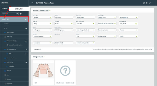
Select the size class, i.e., Missy 0-20, to view its workspace containing the Style Header and Design Image tabs.
-
Scroll down to the Design Images area to create, select, or edit an existing image for the current size class.
-
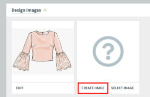
There are two options to associate an image with the size class: Create Image and Select Image. The Create Image area allows users to locate an image within their computer for upload, while the Select Image area allows users to select preexisting images from the Image Folder. The front and back images are the central representations for the entire style folder.
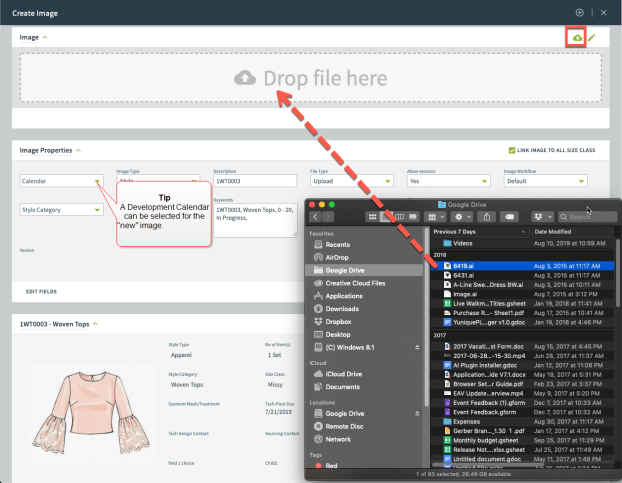
- Create Image opens a window allowing the user to drag and drop a file or search their computer using the cloud icon. The image populates the Drop file here area. Press create image to keep and return to the Style Variation Size Class folder page.
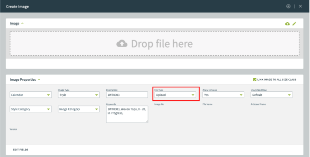
- Press the Create Image button to open the Image Property window.
- Fill in the Image Property fields, if necessary. The File Type drop-down menu gives you the option to upload an existing image or create an image using one of the third-party CAD applications such as Photoshop, Illustrator, and Pointcarre. In this instance, select Upload from the File-Type drop-down.
- Select the cloud icon to locate an image(s) from the user’s local drive.
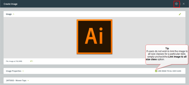
- Press Create Image to associate the image to the Design Image area and return to the Style Variation Size Class folder.
- Repeat the above steps for the Back Image. Adding an image for both the front and back allows the user to toggle between both images when viewing the Style Folder. Resting your cursor over the image will toggle through the set.
-
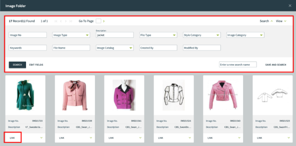
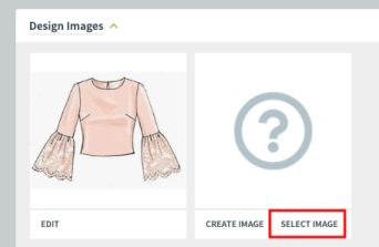
Select Image opens the Image Folder where the user can search for a specific image already uploaded to YuniquePLM and link the image to the Style. The Image Folder closes and returns to the Style Variation Size Class folder page.
- Click the select image button under the Front or Back Image areas. The Image Folder opens to reveal available images.
-
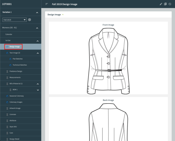
- Select the link option below the desired image. The selected image opens in the Design Image tab.
- Repeat the above steps for the Back Image area. Adding an image for both the front and back, which allows the user to toggle between both images. Resting your cursor over the image will toggle through the set when viewing from the main Style Folder page.
- The Design Image tab now displays both the Front and Back Images.